


According to an article on Forbes.com, “Well-chosen colours reduce the time to insight for your viewers and helps them understand your message sooner and more easily,” which is what we are aiming at when we use data visualizations.
With Zoola Analytics, you can change the colour of your charts to match your branding, tell a specific story, or highlight certain data points.
For some general guidelines, we’ve found that for continuous data, using colour gradients help in showing values that are higher or lower than the neighbouring colour/value. Alternatively, if you are showing categorical data, then you may want to use distinctive colours.
Additionally, you may select specific colours to make a point, i.e., red is great at drawing one’s attention whereas blue is often used to elicit a sense of calm logic.
Follow these instructions to change the colour on your charts:
- Open the Course Enrolment Chart View in the Ad Hoc View repository
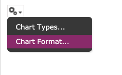
- In the upper left corner, hover over the gears icon and select Chart Format
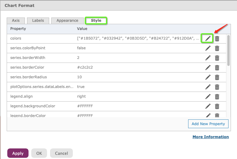
- Navigate to the Style tab
- Click the pencil icon to the right of the colors row
- Replace the current colours with the colour hex codes of your choice
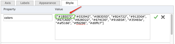
- When you are done, click the green check icon, then Apply (to see your work come to life) and OK to return to your chart.
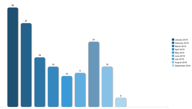
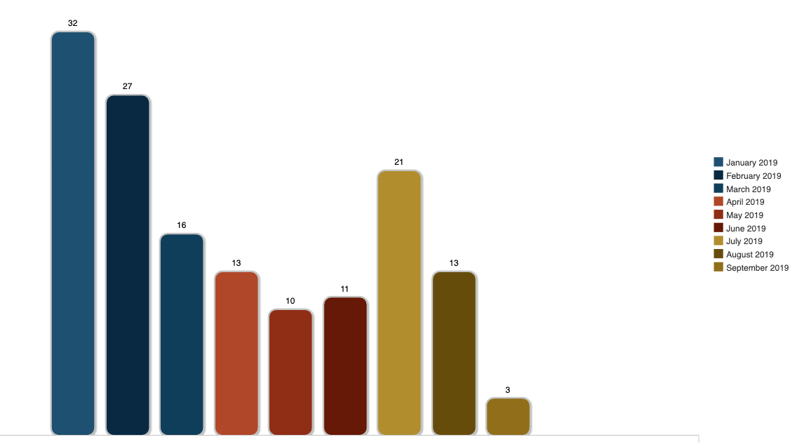
I did two colour tests on this chart, the first is monochromatic in blues:
The second is a split-complementary colour scheme to show gentle but distinct categories. I started with the same blue (January).
To select the colours and create palettes, I find these two sites very helpful:
Try it out on your own on any of these out-of-the-box charts:
- Course Enrollment Chart View
- Course Completion Chart View
- Active Users Count Chart View
To challenge yourself, try changing some of the other chart properties! Follow the instructions in our Case Study: Chart Styling for Bar, Column, Pie, Scatter, Line and Area Charts.